
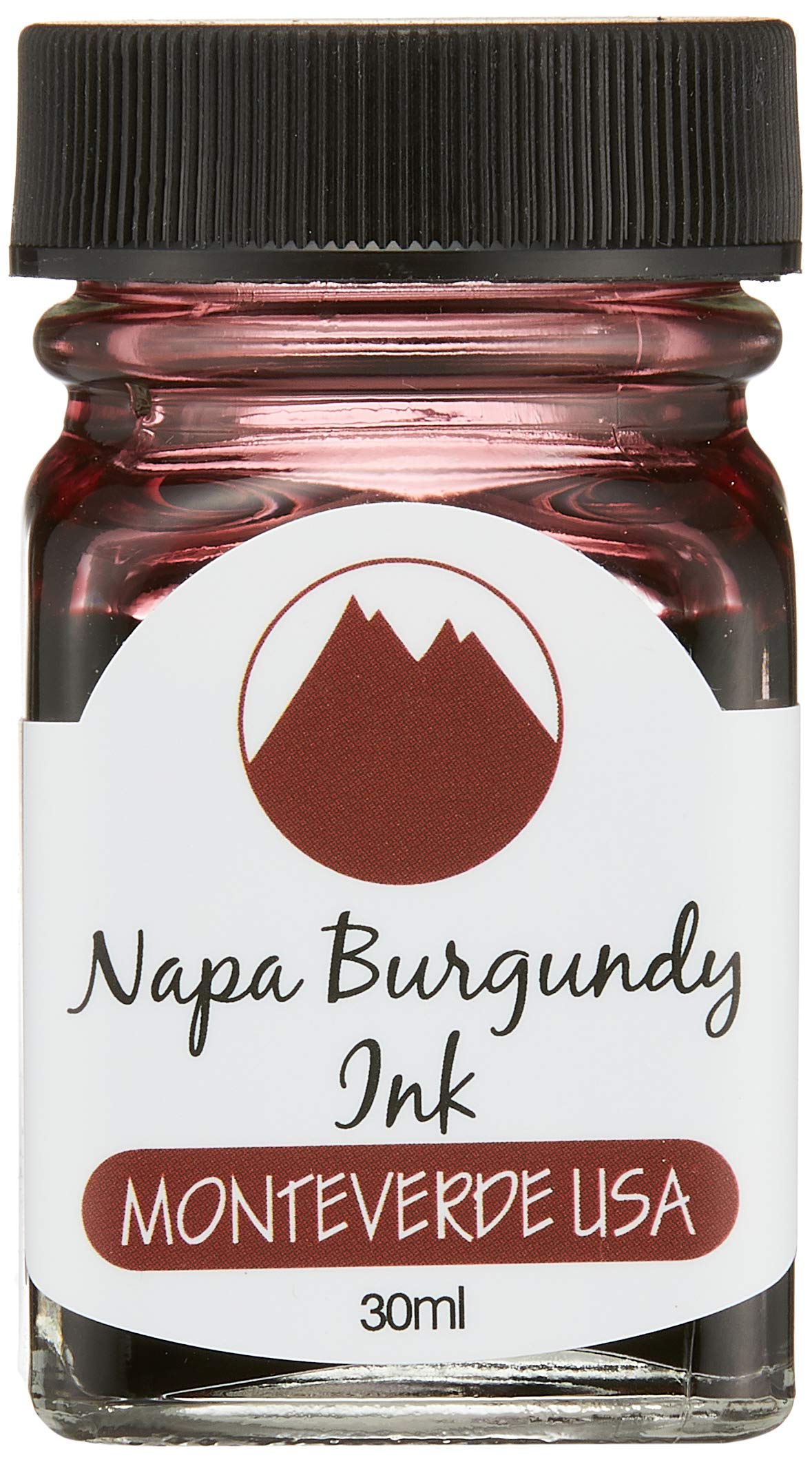
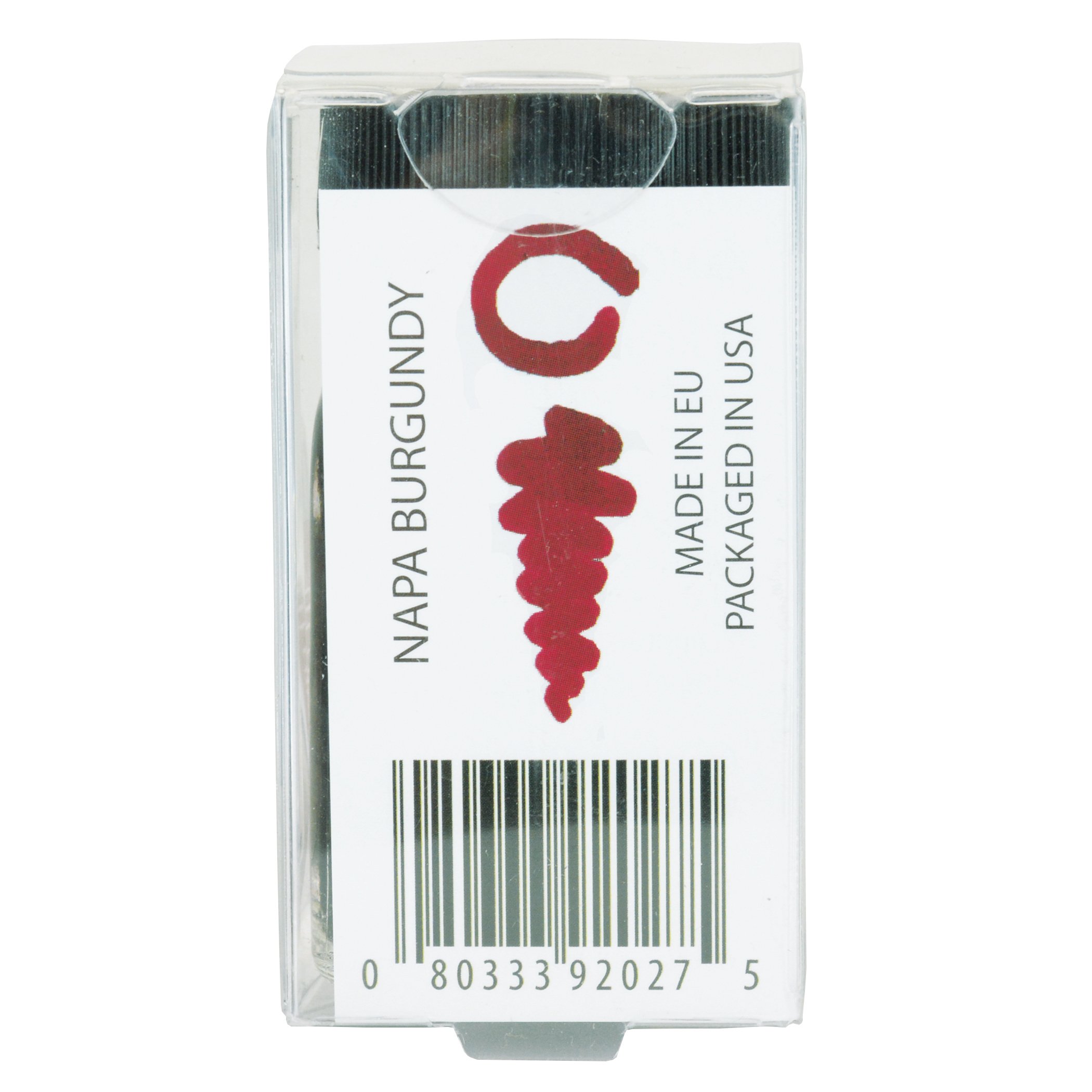
Monteverde USA Ink with ITF Technology, 30 ml Napa Burgundy (G309NB)
D**.
Red like a Ruby when dry
This is a wet ink, meaning it flows easier than most other inks, puts down more ink than "dry" inks, draws a thicker line, will take a bit longer (a few seconds) to dry, and has an easier time bleeding on cheap paper.This is RED, like red nail polish red. Deeper (not darker) red than coke can red, but not shiny. I want a sports car painted with this red; the pictures don't get the shade right. I really like this shade of red, most other reds are darker towards maroon or lighter towards pink. This writes in intense red and it stays the same color red when it dries. I cannot say enough good things about this red!My normal ink is Pelikan 4001 Royal Blue which is a dry ink. As soon as I switched to Ruby Red, i noticed right away that the ink flowed faster. My EF nib lets me write on cheap paper; with the Pelikan ink that was true, with this Monteverde Ruby Red ink, I can still write on cheap paper but it writes like a FINE nib. My EF thin lines are definitely thicker. Paper is good enough that is still isn't bleeding but I've got concerns using this with a medium nib pen would be too much for the cheap paper I use (generic A5 spiral dotted notebook w/ 100gsm paper, about $5-6 on amazon). Your experience may vary depending how cheap you went on paper :)On my monitor, the pictures of Ruby Red seems a bit orangish (same for google image searches for this ink) almost looking like a mango orange. There is definitely no orange when writing w/ a FP. A cartridge rollerball like the Herbin is lighter shade of the same red simply because its so stingy with the amount it puts down. The Frixion red leaning towards a pinkish hue, the rollerball is red but not as intense, and the FP red is intense. This is a deep red, not a dark red. Think candy apple red, without the shine. Think the color of a crayola red crayon (the actual crayon, not the color it makes on the paper).Like I said, I want a sports car in this color...
J**E
Solid middle
Monteverde did a good job with the formulation of this ink. It actually has a good ruby color. To get more pop of the color the usual applies of fountain pen friendly paper, clean pen, etc. Solid middle of the spectrum in regards to wet/dry. Well behaved in all the pens I tried it in. Personally my preference is towards the darker reds and while this is a good color overall it's still a touch to translucent when dry. If that makes any sense.Overall good ink.
D**T
It's lavender
It's good ink. Works well. But it's not really purple: it's more lavender. I shall continue my search for a robust and royal purple.
K**)
A Gorgeous Green
This was my first green bottled ink and what a way to dive into this color. Normally I'm more of a purple, magenta or turquoise ink fan but I decided to step out of my comfort zone. The olivine is a gorgeous color, just like the gemstone it's named for. It looks great in my converted Platinum Preppy and glides over my Clairefontaine paper. Love it.
A**C
Orangey and Thin
This is a decent ink, especially for the price, but it's not the deep and vibrant red I hoped for from something called "ruby." (See, for example, Pantone's "rubine red," which is pure red with maybe a slightly pink hue.) Rather, this leans a bit more in the orange direction of the color spectrum, with a thin, almost watercolor sort of effect. I might charitably say that this gives it a shiny or translucent sort of look, but the fact is, I just feel like it lacks intensity. That said, because it's a bit on the light side it can exhibit some shading, which could be a plus. And that red is there, somewhere: Areas where it pools do get a nice darker and stronger red. I might try leaving the bottle open overnight to allow for some evaporation and see whether than gets me closer to the goal.In any case, good flow, lubrication, etc, as is typical of Monteverde inks. And maybe a useful color as orange. Just not quite the effect I was going for when I ordered a "red" ink.
A**R
Better than expected, but leaked a lot
Took a lot of water and elbow-- wrist rather -- grief to be usable. The package wasn't damaged, neither was the bubble wrap around the ink in plastic cuboid. Yet there were clear signs of leakage prior to shipping -- the paper attachment was stained green, and pressing the top of the bottle made more ink ooze from beneath the packaging tape[!]. Like the color, and wont be sending back... but expected much better delivery given it cost more than other inks by the same manufacturer.
J**S
Very good ink
Of all the green inks I have tried this one is my favorite. It looks very much like what I consider a true green. It flows well but it is not too wet and it seems to dry in a reasonable time
W**W
Wrong Ink inside the correct bottle
This is more of a PSA than a review. I believe that this is a different colour to pink. I ordered the first bottle 13/01/21 and received a replacement on the 14th, before reporting this problem to Amazon for them to check.TL;DR: If it's a pastel-esque pink then you're fine, however, if it's more of a purple, chances are it's a different colour.There isn't a proper reason why this link is bad, rather, I believe that the ink is wrong!When I first opened the bottle, impressions were decent. The bottle came sealed in some shrink-wrap and in a clear box. However, with the first look at the colour through the bottle, it looked too dark to be pink.I have tried many different colours of ink, and while someone who isn't too picky about colours could argue that this is a very dark shade of pink. I would say NO.You can see another comment about this ink saying it's a horrible brown colour. I believe that I have the same ink, however, I don't think that it's a horrible colour. It has a very close resemblance to the Iroshizuku Yama-budo, more of a purple colour, but without the sheen. Looking closer, although you might not be able to tell with the photo, this ink is somewhat cooler than the Yama-budo. I have uploaded a photo to show the comparison on Tomoe river paper (although they are in different pens).[If you still think that this is a pink colour, Iroshizuku also do a pink and it's called Kosumosu - there is a stark difference between the two. I have also given a comparison to the Sailor Manyo ink, Sakura, which is more of an orange colour. Although this is more of an orange, the saturation should be similar. The photo should be used as a comparison but isn't what it looks like in person, for example, the Sakura looks more pastel-orange rather than neon, and I attempted to take a photo which would show the bottle, leaflet, writing and also to get the Yama-budo without much sheen, as TR paper is really a shading and sheening monster and photos further accentuate that.]I would make the assumption that this is the purple ink but just inserted in the wrong bottle, as this colour also matches the purple sample on their little leaflet in the box. Looking online, the proper colour is supposed to be a really light pink colour. This is a shame, as I really did want that colour, but I am unsure if the colour is right now.I have contacted Amazon about this, and they said that this was under review after providing me with a refund. I would have left it like that, and not written a review, but I am not sure if they have realised the problem and fixed it as it is quite subtle - the bottle and packaging say Rose Pink although the ink isn't and one would need testing of the ink and familiarity of the colours to make the correct judgement.As ink, however, I am satisfied with the way it flows and performs. It is indeed more of a mature colour and is easy on my eyes. The performance of inks vary between colours, not just brands, and as this ink is different, the performance of the proper pink could be different.So overall, good ink but wrong colour. The problem should be fixed by now, but if it isn't, I would probably suggest contacting Amazon, as they are the ones who are selling it. If you receive the correct light pink colour, then this review is not applicable and you should ignore it.I have put a low rating to draw attention to readers, but honestly, I believe this is somewhat unfair and would have liked to make some sort of PSA instead, but that wasn't possible.
M**N
Teal ink with red sheen!
I absolutely love this ink. I use it in dip pens and I write with a copperplate style. Thick lines down, thin lines up. This lovely ink has an occasional red sheen. I have used it on Clairefontaine paper, 150g cartridge paper, and Tomoe River paper and the red effect has shown up on each of them. Though on the cartridge paper that was only when I coloured in a cm wide heart. The teal colour is more green than blue, but lovely in itself, but when the red sheen shows up, it is amazing.
R**2
A great everyday blue.
Very nice colour. Well lubricated, vibrant, easily cleaned out of the converter, and cheap.
J**A
My wife loves it.
My wife loves it, that's all you need to know!
J**E
A wonderful colour
A beautiful colour and quality ink.
Trustpilot
3 weeks ago
3 weeks ago